Population Growth Over Years

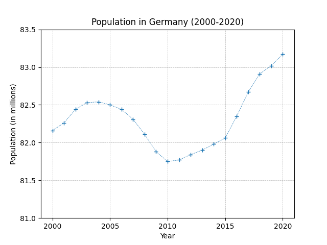
This plot is nearly complete. You just need to adjust the ticks on the X-axis. We want a tick every 5 years. Define the ticks to complete the exercise.
Expected:
matplotlib expected figure
Output:
import matplotlib.pyplot as plt import numpy as np population = np.array([ 82.16, 82.26, 82.44, 82.53, 82.54, 82.50, 82.44, 82.31, 82.11, 81.88, 81.75, 81.77, 81.84, 81.90, 81.98, 82.06, 82.35, 82.67, 82.91, 83.02, 83.17 ]) plt.plot(np.arange(2000,2021),population, linewidth=0.5, ls='--', marker='+') # define X-ticks here...
plt.yticks(np.arange(81,84,0.5)) plt.grid(linestyle='--', linewidth=0.5) plt.title('Population in Germany (2000-2020)') plt.xlabel('Year') plt.ylabel('Population (in millions)') plt.show()
Python
Setting up Python environment...
Output