Create scatter plot with pandas columns
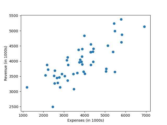
Let's visualize some data from the companies dataset. Compare the companies' expenses and revenue using a scatter plot. Create a plot that matches the one in the image. Hint: First, extract the correct columns from the DataFrame. Use the
DataFrame.columns attribute to find the correct column names. You need to divide the column values by 1000 for the plot.Premium
Expected:
Output:
Python
Setting up Python environment... Output