Matplotlib II
Bar Charts
Learn how to create vertical and horizontal bar charts using plt.bar() and plt.barh(), and how to customize their colors.
Bar charts are ideal for comparing values across categories. Use plt.bar() for vertical bars and plt.barh() for horizontal bars.
Let's create a simple vertical bar chart comparing language popularity:
Python
Output
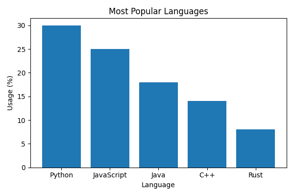
The first argument to plt.bar() is the category labels, the second is the bar heights. Labels and title work just like in line plots.
What will be the output?
Python
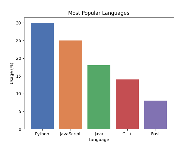
Use the color parameter to set bar colors — pass a single color or a list of colors:
Python
Output
What will be the output?
Python
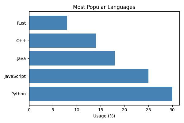
Horizontal bar charts work well when category labels are long. Use plt.barh() — the axes are swapped, so xlabel labels the value axis:
Python
Output
What will be the output?
Python
What will be the output?
Python
What will be the output?
Python