Matplotlib II
Histograms
Learn how to visualize the distribution of numerical data using plt.hist() and how the bins parameter controls the level of detail.
Histograms show how data is distributed across a range. Use plt.hist() — it groups values into bins and draws a bar for each bin.
Here's a histogram of simulated height data using 10 bins:
Python
Output
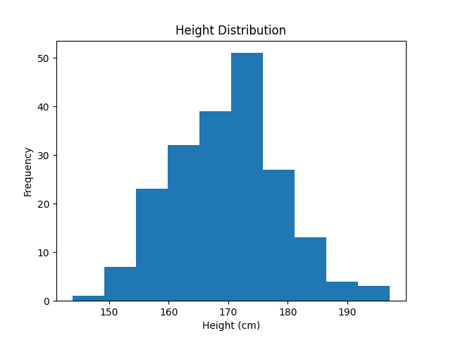
The bins parameter controls how many bars the histogram has. More bins = more detail; fewer bins = smoother overview.
What will be the output?
Python
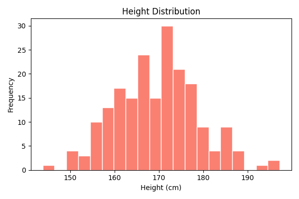
More bins reveal finer details. You can also add color and edgecolor to improve readability:
Python
Output
What will be the output?
Python
What will be the output?
Python
What will be the output?
Python
What will be the output?
Python