Matplotlib

Customizing plot appearance

In this lesson, you will learn how to modify different aspects of your plot, such as adding a grid or customizing the ticks along the axes.


You already know many ways to adjust the appearance of the line.

But the line is not the only thing you can customize.

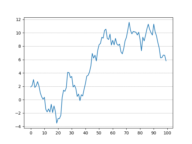
Let's have a look at the axes of the following figure.

import matplotlib.pyplot as plt import numpy as np np.random.seed(80) y = np.cumsum(np.random.randn(100)) plt.plot(y) plt.show()
Python
Output
example plot

Notice that the ticks on the x-axis are somewhat sparse. Currently, there's a tick every 20 units.

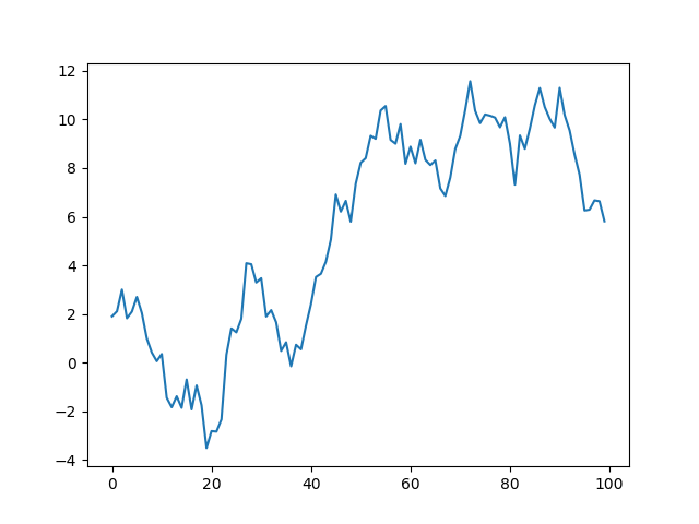
Suppose we need a tick mark every 10 units. We can achieve this using the plt.xticks() function:

# create a sequence of numbers x_ticks = [0, 10, 20, ...] # change ticks of existing plot plt.xticks(x_ticks)
Python

You can pass any sequence of numbers like a list, a range, or a NumPy array.

Let's apply this to our example:

import matplotlib.pyplot as plt import numpy as np # Generate data np.random.seed(80) y = np.cumsum(np.random.randn(100)) plt.plot(y) # define ticks of the x-axis plt.xticks(np.arange(0,101,10)) plt.show()
Python
Output
example plot

You can do the same for the Y-axis using plt.yticks().

Let's take another look at our plot. Even with additional ticks, it's still hard to pinpoint specific points on the plot.

Let's improve this by adding a grid to our plot using plt.grid()

import matplotlib.pyplot as plt import numpy as np # Generate data np.random.seed(80) y = np.cumsum(np.random.randn(100)) plt.plot(y) plt.xticks(np.arange(0,101,10)) # add a grid plt.grid() plt.show()
Python
Output
example plot

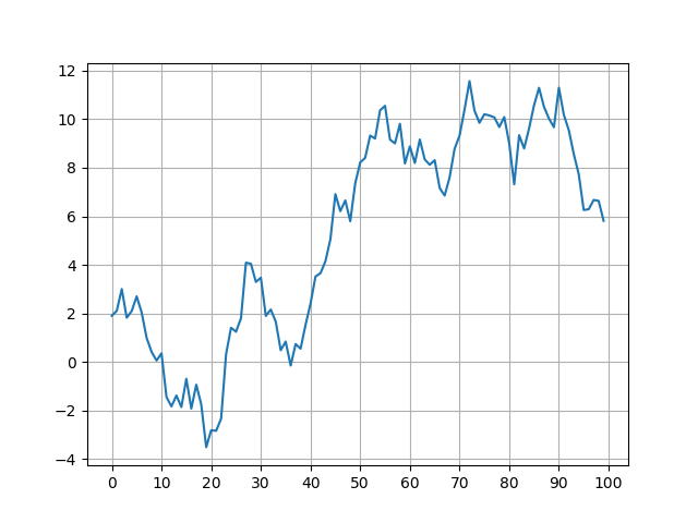
You can customize the grid lines' appearance using the color, linestyle, and linewidth arguments that you already know from above.

# change linestyle, linewidth, and color of grid plt.grid(color='gray', linestyle='--', linewidth=0.5)
Python

The argument axis is used to only display gridlines along a specific axis.

# both axes (default) plt.grid(axis='both') # X-axis plt.grid(axis='x') # Y-axis plt.grid(axis='y')
Python

Let's add some gray, dashed gridlines along the Y-axis of our plot:

import matplotlib.pyplot as plt import numpy as np # Generate data np.random.seed(80) y = np.cumsum(np.random.randn(100)) plt.plot(y) plt.xticks(np.arange(0,101,10)) # add a grid and style the grid lines plt.grid(axis='y', linestyle='--', linewidth=0.5, color='gray') plt.show()
Python
Output
example plot