Introduction to Matplotlib
In this lesson, we will create our first basic plots using the matplotlib library.
Let's start with some data.
Let's say this data represents a stock's price over an entire year.
Just by looking at the raw data, we can't really say much about it.
It would be much better if we had a graphical representation of it, like the ones we see in the news about financial markets.
Luckily, there's a great library for data visualization in Python: matplotlib.
Just as we did with NumPy, we need to first install matplotlib and then import it using the import keyword:
This allows us to use the pyplot module from matplotlib under the alias plt.
Let's create our first plot:
So, what happened here?
We used two functions from the matplotlib.pyplot module:
plt.plot() to create a basic line plot.
And plt.show() to display the plot.
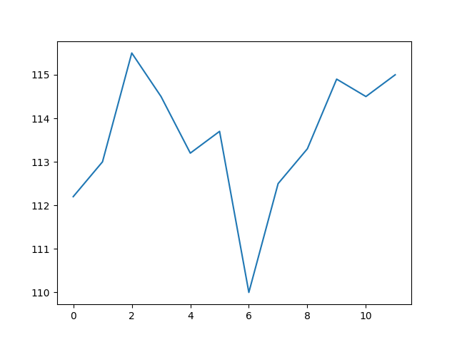
As you can see, just by passing our stock_price list to plt.plot(), we already get a nice-looking line plot with 2 axis.
But wait a second, how can we have a 2-dimensional figure if we just passed a single list of elements?
By default, if you don't provide data for the horizontal axis, matplotlib assumes it is a sequence of integers starting from 0.
Indeed, if we look at the plot again, you can see that the line starts at 0 on the horizontal (or x) axis.
Let's add some more meaningful data on the x-axis:
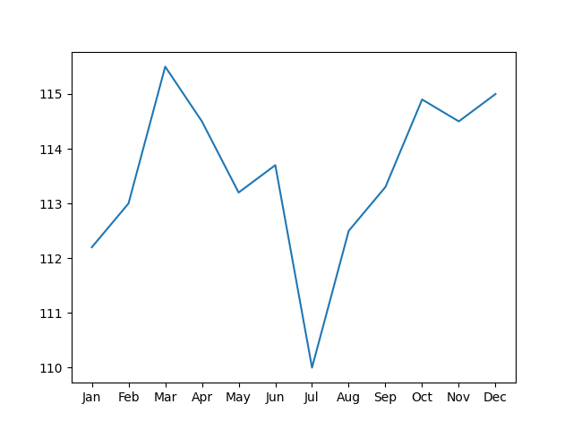
Much better!
However, just by looking at the plot, it's not really obvious what it shows.
What's missing are some labels and a title.
Adding a title to our plot is simple:
To add labels to our axes, we use:
Let's see this in action:
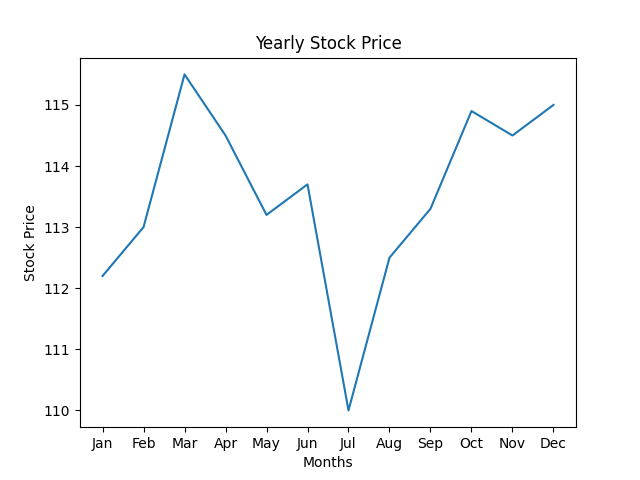
Awesome! That's it for now.