Matplotlib

Tutorial: Introduction to Scatter Plots

In this lesson, you will learn about a new type of graph: scatter plots. You will discover how to create these plots, understand their use cases, and see how they differ from line graphs.


So far, we've explored the use of line plots to visualize continuous data trends and relationships between variables.

Line plots are excellent for showing how one variable changes in relation to another, especially when the data points are connected sequentially.

However, not all data is suited for line plots.

Sometimes, our data consists of individual points that do not have a meaningful sequence or continuity.

Let's say we want to explore the relationship between GDP per capita and life expectancy accross different countries.

Here, we have data for these two indicators across various countries in 2020 (World Bank). Let's try to visualize them using a line plot:

import matplotlib.pyplot as plt import numpy as np gdp = np.array([63529, 51868, 46750, 43562, 40217, 40041, 10409, 10194, 6924, 5753, 1913]) life_expectancy = np.array([77, 83.2, 81, 81.7, 80.4, 84.6, 78.1, 71.3, 74, 65.3, 70.2]) plt.plot(gdp, life_expectancy) plt.xlabel('GDP per capita (current US$)') plt.ylabel('Life expectancy at birth (years)') plt.title('GDP per Capita vs. Life Expectancy (2020)') plt.show()
Python
Output
example plot

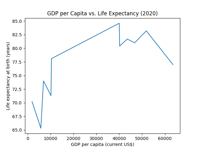
Looks strange, doesn't it? Well, that's because it doesn't make sense to connect the individual data points with each other because they don't represent a meaningful sequence.

We can fix this by removing the line with the linestyle argument and instead mark each individual point with a circle:

import matplotlib.pyplot as plt import numpy as np gdp = np.array([63529, 51868, 46750, 43562, 40217, 40041, 10409, 10194, 6924, 5753, 1913]) life_expectancy = np.array([77, 83.2, 81, 81.7, 80.4, 84.6, 78.1, 71.3, 74, 65.3, 70.2]) ############## remove line and add marker ############## plt.plot(gdp, life_expectancy, linestyle='', marker='o') ######################################################## plt.xlabel('GDP per capita (current US$)') plt.ylabel('Life expectancy at birth (years)') plt.title('GDP per Capita vs. Life Expectancy (2020)') plt.show()
Python
Output
example plot

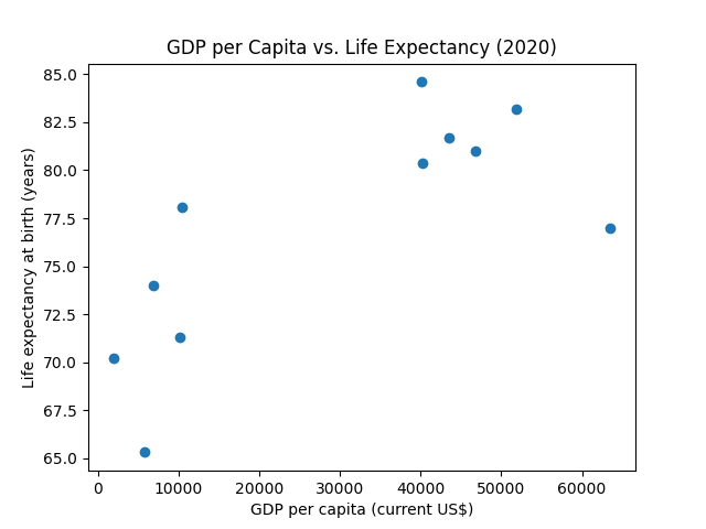
This looks much better and provides a clear visualization of the two indicators, aiding in understanding potential patterns.

This type of graph is called a scatter plot.

Scatter plots allow us to observe and analyze the distribution and relationship of data points in a two-dimensional space without implying any connection between them.

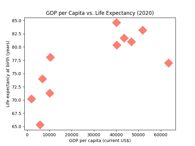
But, instead of hiding the line of a line plot as we have done, we can directly create a scatter plot using matplotlib's plt.scatter() function:

import matplotlib.pyplot as plt import numpy as np gdp = np.array([63529, 51868, 46750, 43562, 40217, 40041, 10409, 10194, 6924, 5753, 1913]) life_expectancy = np.array([77, 83.2, 81, 81.7, 80.4, 84.6, 78.1, 71.3, 74, 65.3, 70.2]) ############## create scatter plot ############## plt.scatter(gdp, life_expectancy) ################################################# plt.xlabel('GDP per capita (current US$)') plt.ylabel('Life expectancy at birth (years)') plt.title('GDP per Capita vs. Life Expectancy (2020)') plt.show()
Python
Output
example plot

The plt.scatter() function comes with a lot of features that are specifically designed for scatter plots.

Let's customize the style of the data points.

We'll change the marker (marker), the color (c), and the size (s) of the data points:

import matplotlib.pyplot as plt import numpy as np gdp = np.array([63529, 51868, 46750, 43562, 40217, 40041, 10409, 10194, 6924, 5753, 1913]) life_expectancy = np.array([77, 83.2, 81, 81.7, 80.4, 84.6, 78.1, 71.3, 74, 65.3, 70.2]) plt.scatter( gdp, life_expectancy, ########## customize data points ########## marker = 'D', # add diamond markers s = 200, # change size of markers (default = 20) c = 'salmon' # change color of markers ########################################### ) plt.xlabel('GDP per capita (current US$)') plt.ylabel('Life expectancy at birth (years)') plt.title('GDP per Capita vs. Life Expectancy (2020)') plt.show()
Python
Output
example plot

Great! But there are more useful things you can do with these arguments.

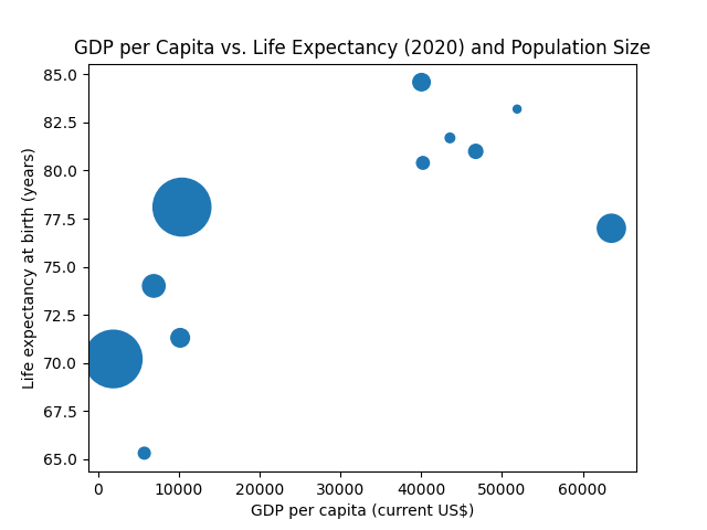
For example, the size argument can accept not only a single value but also a sequence of values, one for each data point.

This way, you can add a third dimension to your plot by changing the marker sizes based on a third data variable.

Let's adjust the marker size based on each country's population (in millions):

import matplotlib.pyplot as plt import numpy as np gdp = np.array([63529, 51868, 46750, 43562, 40217, 40041, 10409, 10194, 6924, 5753, 1913]) life_expectancy = np.array([77, 83.2, 81, 81.7, 80.4, 84.6, 78.1, 71.3, 74, 65.3, 70.2]) ######### new variable for population in millions ######### population = [331.51, 25.65, 83.16, 38, 67.08, 126.26, 1411.1, 144.07, 213.2, 58.8, 1396.39] ########################################################### plt.scatter( gdp, life_expectancy, ###### vary marker size with population ###### s = population ############################################## ) plt.xlabel('GDP per capita (current US$)') plt.ylabel('Life expectancy at birth (years)') plt.title('GDP per Capita vs. Life Expectancy (2020) and Population Size') plt.show()
Python
Output
example plot

Great! However, something's missing.

Wouldn't it be helpful to know which data point corresponds to which country?

We can achieve this using the plt.annotate(text, xy, ...) function.

It's used to add a label to specific coordinates in your figure.

For instance, the code below would add the label Brazil to a point with GDP per capita of 30000 and Life expectancy of 77 on the plot:

plt.annotate('Brazil', (30000, 77))
Python

To add labels to each actual data point, we can use plt.annotate() within a loop that iterates over each point in our plot:

import matplotlib.pyplot as plt import numpy as np gdp = np.array([63529, 51868, 46750, 43562, 40217, 40041, 10409, 10194, 6924, 5753, 1913]) life_expectancy = np.array([77, 83.2, 81, 81.7, 80.4, 84.6, 78.1, 71.3, 74, 65.3, 70.2]) population = [331.51, 25.65, 83.16, 38, 67.08, 126.26, 1411.1, 144.07, 213.2, 58.8, 1396.39] ############ new variable for countries ############ countries = ['USA', 'Australia', 'Germany', 'Canada', 'United Kingdom', 'Japan', 'China', 'Russia', 'Brazil', 'South Africa', 'India'] #################################################### plt.scatter( gdp, life_expectancy, s = population ) plt.xlabel('GDP per capita (current US$)') plt.ylabel('Life expectancy at birth (years)') plt.title('GDP per Capita vs. Life Expectancy (2020) and Population Size') ############ add country labels ############ for index, country in enumerate(countries): plt.annotate(country, (gdp[index], life_expectancy[index])) ############################################ plt.show()
Python
Output
example plot

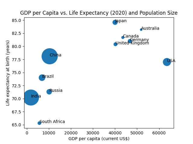
plt.annotate() accepts additional arguments that allow customization of label position and appearance.

Check out the official matplotlib documentation for more information.

Similarly to the marker sizes, you can also vary the marker colors according to some data.

Let's fix the marker size in our example and link the color to the population:

import matplotlib.pyplot as plt import numpy as np gdp = np.array([63529, 51868, 46750, 43562, 40217, 40041, 10409, 10194, 6924, 5753, 1913]) life_expectancy = np.array([77, 83.2, 81, 81.7, 80.4, 84.6, 78.1, 71.3, 74, 65.3, 70.2]) population = [331.51, 25.65, 83.16, 38, 67.08, 126.26, 1411.1, 144.07, 213.2, 58.8, 1396.39] plt.scatter( gdp, life_expectancy, s = 300, ######### vary color by population ######### c = population ############################################ ) plt.xlabel('GDP per capita (current US$)') plt.ylabel('Life expectancy at birth (years)') plt.title('GDP per Capita vs. Life Expectancy (2020)') plt.show()
Python
Output
example plot

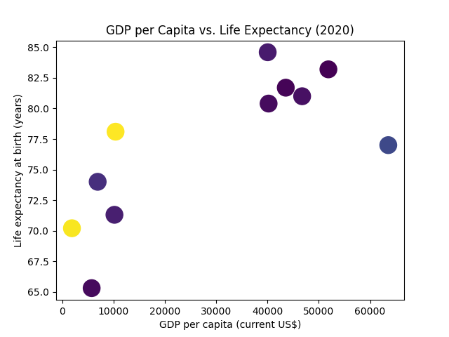
Great! However, the meaning behind the colors isn't very clear.

To clarify the meaning, we can add something called a colorbar.

import matplotlib.pyplot as plt import numpy as np gdp = np.array([63529, 51868, 46750, 43562, 40217, 40041, 10409, 10194, 6924, 5753, 1913]) life_expectancy = np.array([77, 83.2, 81, 81.7, 80.4, 84.6, 78.1, 71.3, 74, 65.3, 70.2]) population = [331.51, 25.65, 83.16, 38, 67.08, 126.26, 1411.1, 144.07, 213.2, 58.8, 1396.39] plt.scatter( gdp, life_expectancy, s = 300, c = population ) ######### add colorbar with label ######### plt.colorbar(label='Population in millions') ########################################### plt.xlabel('GDP per capita (current US$)') plt.ylabel('Life expectancy at birth (years)') plt.title('GDP per Capita vs. Life Expectancy (2020)') plt.show()
Python
Output
example plot

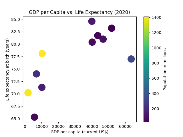
Much better, isn't it?

That's it for now. Again, there are so many options to customize every detail in your plots. It's impossible to cover it all.

For more in-depth information, refer to the official matplotlib documentation.