Tutorial: Plotting Multiple Data Series on the Same Graph
In this lesson, you will learn how to represent different data series as lines on the same graph, allowing for easy comparison and analysis.
Line plots are very helpful for visualizing trends and patterns in a series of data.
However, they are not limited to a single line.
In fact, you can add as many lines to a matplotlib figure as you wish.
Adding another line in matplotlib is straightforward—simply call plt.plot() again with new data:
Let's see how this works in practice:
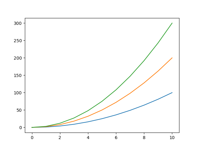
Here we have a plot with 3 lines, all sharing the same values on the X-axis, ranging from 0 to 10.
Each line represents the output of a different quadratic function.
However, there's a small issue: we can't easily differentiate which line corresponds to which function.
What we need is a legend that clearly labels each line with its corresponding function or dataset.
To add a legend, we first need to label our lines using the label argument:
After that, we call the plt.legend() function:
Let's add a legend to our example plot:
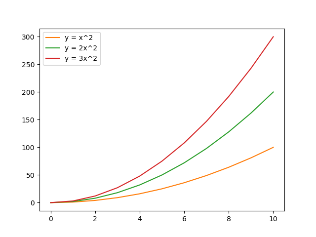
Awesome! Matplotlib automatically changes the colors of the lines to differentiate them.
However, you can also customize each line according to your preferences.
Let's adjust the linestyle of our lines:
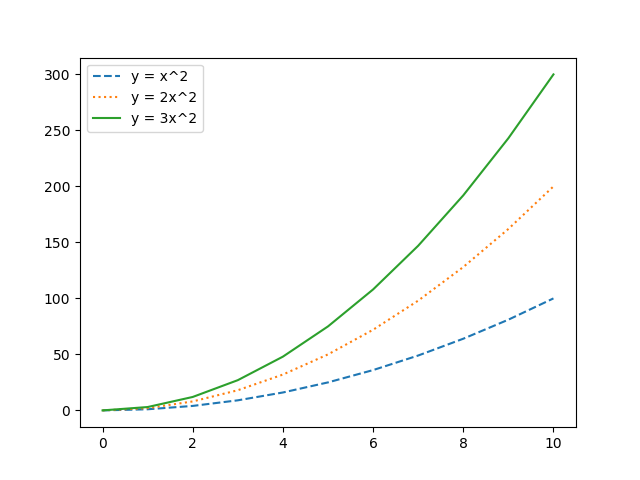
Notice that the legend changes according to the style of your lines.
Great! Now you can add multiple lines to a plot, each representing different data.
You will see later that this is not just limited to lines. In fact, you can plot various types of visualizations such as scatter plots, bar charts, histograms, and more, each tailored to display different aspects of your data.